
While many businesses can benefit from strong design graphics to push their message into the public, not all of us are cut out for graphic design.
The best signage company knows that a sign alone can only do so much. Interesting and compelling graphics can elevate your business beyond just words, yet relies on experts to adequately convey your message. For those of us without relevant experience, our perception of what makes for great signage might not resonate with the customers we are looking to target.
Whether you have an internal graphic design team or rely on experts like us, it is important to keep in mind what your audience is looking for from design graphics. Below, we have listed three of the most common design graphic mistakes, and how these issues are resolved.
Using Words Instead of Visuals
The pen may be mightier than the sword, but words can only benefit your business so much when used on signage. A clever turn of phrase can catch the eye and can help associate a link between your sign and your business, but relying only on words is an easy way to lose the attention of your audience.
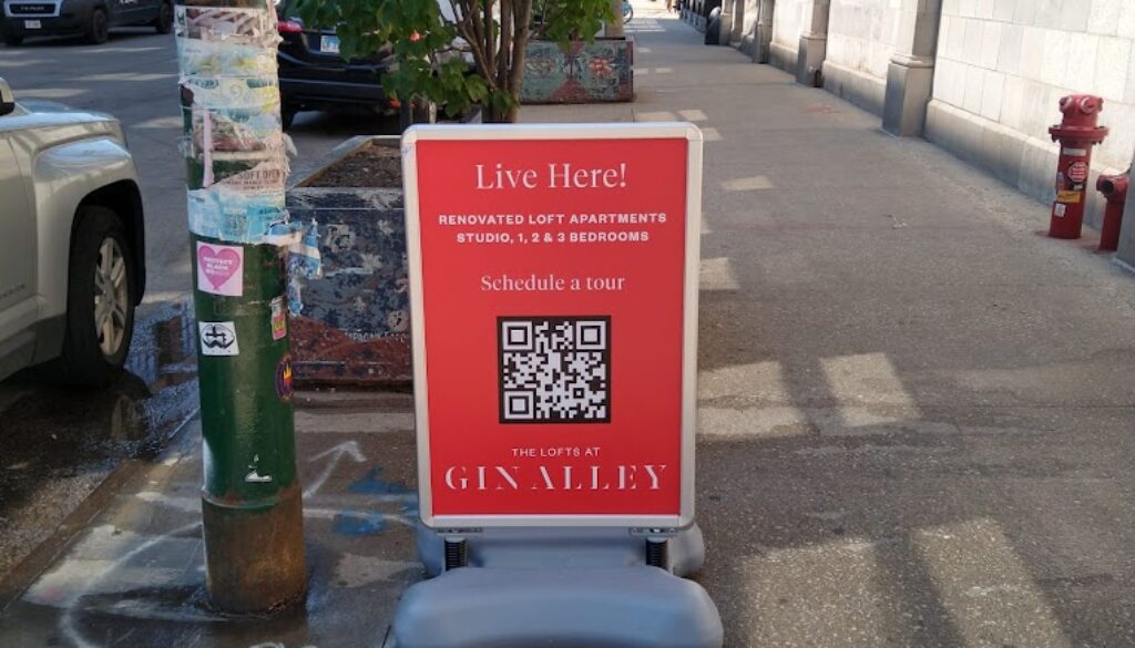
People rely on visual cues to draw their eyes to your sign. An image of what it is that you do or the audience that you are looking to target will help make a sign more relevant to your audience.
- The human eye is naturally drawn to the image of other faces. Images of people will help direct attention to your signage.
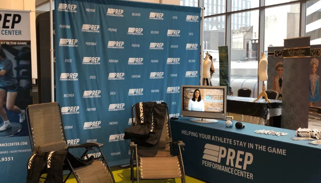
- Choose images that are relevant to your business. Restaurant signage, for instance, should focus on the food that they serve.
- Keep text elements limited to exactly what needs to be conveyed. People spend only a few seconds looking at a sign – providing a paragraph on what it is that you offer can deter customers from engaging with your sign.
Negative Space Yields Positive Results in Design Graphics
Even the best storefront signage will only have potential customers attention for longer than a few seconds. Because of this, it is important that you present all of the relevant information to them as quickly and efficiently as possible. Leveraging contrast and negative space are two of the best ways to do this.
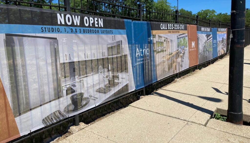
Good signage will catch your eye and draw patrons to what you are looking to advertise. But this doesn’t mean it should distract them from your central message. A message that contains too much information will fail to convey the meaning you are looking to dictate. Real estate signage, for instance, should balance images of the space being sold as well as who needs to be contacted.
Use bright colors or bold letters that stand out from the background of your sign, so that viewers can immediately see what you are trying to tell them. Neutral colored text against a neutral background, like grey on black, pushes this meaning into the background, not only confusing your viewers but deterring them from reading your sign.
Transferring Signage from Idea Stage to Installation Stage
We’ve seen it too often – a brilliant design concept that perfectly articulates your brand or offerings needs to fit the space allotted. Storefront signage that gets cut off between window panes leads to a disjointed message that confuses viewers and leads to neutral or negative results.
Understanding how your sign fits into the environment is crucial for producing results. For instance, again consider how a restaurant uses storefront signage to draw customers. They’re likely to enter not because they see the word “hamburger” but because they see an image of a mouthwatering, juicy burger and respond to their hunger. If that same picture is cut off, stretched, or pixelated, they won’t respond in the same way.
People rely on signs to convey direction and meaning, and the correct placement and installation is crucial to this process. Consider how a sign hangs, where it cuts off, and how viewers will respond to your graphics.
Great Design Graphics Lead to Great Customers
What makes Bishop Image Group the best signage company in Chicago? We’re focused on every step of the process, from design to execution. Even when working with in-house designers, we’ve found that simple mistakes are made when installation considerations aren’t taken into account – our team is focused on making sure every box is checked.
Looking for assistance with your next signage project? We can help! Contact us today for more information about our service and offerings.