Unbelievably, retail establishments and restaurants don’t just choose their favorite colors when developing their signage. In fact, there’s a great deal of psychology behind the colors used for channel letters, window signs, and other types of signage. Below, you can learn more about how these colors can generate emotions and which colors you should use to have the biggest impact.
What Do Colors Mean?
The most successful businesses choose color very carefully when designing their logos and signage, and they do this because individual colors elicit certain emotions within the consumer within seconds.
Red
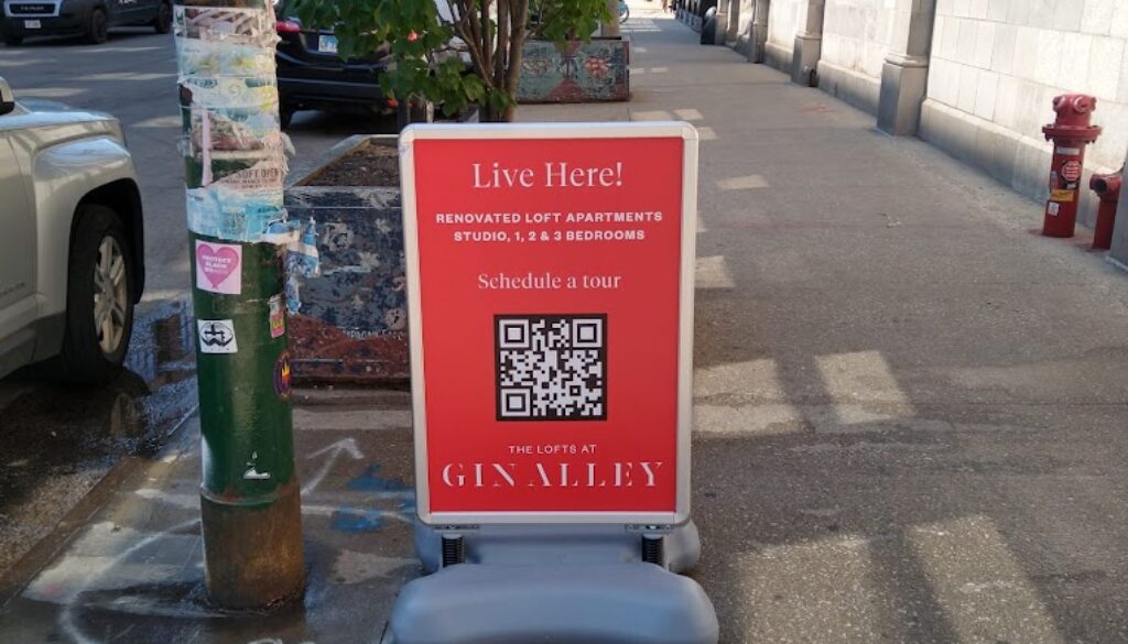
Red is known to stimulate the consumer and grab their attention, so it comes as no surprise that it’s incredibly popular among restaurants. Steak ‘n Shake, McDonald’s, Wendy’s, and many other well-known restaurants use red to stimulate hunger. Red can also be used to indicate love, heat, urgency, courage, or fun.
Pink
Pink is soft and warm it’s often associated with calmness, innocence and optimism. Pink generates feelings of nurturing, femininity, sweetness, happiness, and compassion. Some brands that have used pink in their logos include, Dunkin’ Donuts, Baskin Robbins and Victoria Secret.

Yellow
In a sea of color, the eye will always notice yellow first. McDonald’s used this to its advantage with the Golden Arches, and if you look at many of your favorite logos, yellow is a key player. It is cheerful, warm, and optimistic, and in many cases, it can also construe a sense of affordability to the consumer.
Orange
Orange is fun and casual, which is evident when you look at companies like Harley-Davidson, Nickelodeon, and Hooters. Orange can also create feelings of energy, creativity, and confidence.
Blue
Blue is the single most popular color among consumers, and more than half will claim blue is their favorite color in surveys. Blue indicates trust and authority and has a calming effect, which is why it’s so commonly used on hospital walls. Facebook, Chase, IBM, and Unilever all use blue to generate feelings of trust with consumers and help them appear more professional.
Green
Light green elicits feelings of nature and health, while dark green evokes emotions surrounding wealth, elegance, and royalty. It’s common among eco-friendly brands, and it’s also ideal for finance companies. Some of the brands using green to their advantage include Cargill, Animal Planet, and Green Giant, and it’s also the color of cold, hard cash.
Purple
Purple means luxury, magic, mystery, courage, and prestige. Some of the most well-known brands using purple to influence consumers include FedEx, Roku, Twitch, and Taco Bell.
Black
While some people believe there are negative connotations associated with black, it’s a neutral color that can convey power, strength, and authority. It’s also quite common among tech companies and can even be used to indicate glamor or sleekness. Nike, Louis Vuitton, Prada, and Coach all use a lot of black in their signage and advertising.
Brown
Brown reminds people of the earth; companies use it to elicit feelings of stability, dependability, and honesty. UPS has used brown for years to show consumers they’re the most reliable shipping company, and companies like M&M’s and Ugg use it, as well.
White
White is another neutral color that represents peace, purity, innocence, and positivity. It’s also the go-to color for representing cleanliness. Kitchens, bathrooms, and hospitals tend to use a lot of white in their decor for these reasons.
When designing signage for your retail business or restaurant, choose colors that help you describe your business according to the emotions you want to elicit. For example, red and white are excellent choices for restaurants because they elicit hunger and indicate cleanliness, whereas brown or purple can help your business appear trustworthy and safe. If you are interested in professional signage for your business, reach out to the experts at Bishop Image Group. We have 20 years of experience in color psychology and design, and we look forward to hearing from you.


